Hey, just droppin' some more artistic insight on you foos out there!
I was chatting with a buddy on Skype today, and he wanted to know about layout/thumbnailing. For some reason, he couldn't grasp it or always felt obligated to go beyond and always complete everything in a large format.
There's nothing wrong with doing that, it's perfectly fine to do. And since art's an expressive subject, there really aren't any hardcore rules! However...
If you're starting off and still haven't grasped many fundamentals of what you're aiming to do, or if you're still a big learner, laying out your idea in thumbnails can be very crucial into helping you achieve the desired result.
For example, say you have this quick idea in your head, but it goes away if something else jumps in your mind. Draw a small stick figure (and I mean "small" like the size of your thumb") and voila! The general idea is there. And in case you lose it, you can always view that stick and expound on it. But I don't draw stick figures.
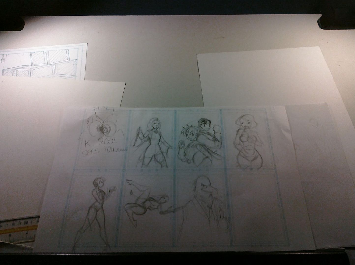
Here's a template I created for myself, called the Super Thumbnail Frame Comic Guide Turbo EX Alpha X8! Yes, I created a name for it. What it is, is basically a grid with 8 frames proportioned with the general comic format/11x17 paper. These are all the sketches I had scheduled to do today. I draw my quick thoughts on the paper, just to get the idea out my head. As you can see, these are no where near finished. And you can see how easily my mind can wander, King K. Rool doesn't even belong in there. I then print this grid out on printer paper (or even larger). I printed out on 11x17 paper, but it's best to go smaller with regular A4 printer paper to keep yourself from adding too much detail.
I use these layouts for when I'm doing comic layouts for my clients (when I'm working on comic pages) or even for commissions. I try to keep everything in proportion where the client can print if he/she needs to. But this works great for comics because you even have your page layout as well. So you hit two birds with one stone! 50000 bonus to your score!
I then scan these in Photoshop, select a picture with the box selection tool, copy, open a new document, paste, put a Cyan color on a separate Overlay layer above it, merge em, adjust the opacity so the blue is light enough for me to see when drawing it after it's printed out, I print it out, and then do the fine sketch/lineart over it. Then I scan it in again and remove the blue with an adjustment layer.
Seems like a lot, but fortunately, my ink cartridges for the printer are big. So no worries. I rather do this than lightbox any day.
Well, that's all I have to say for today. And I will start doing daily music posts I enjoy off youtube!
Tuesday, April 06, 2010
Subscribe to:
Post Comments (Atom)


No comments:
Post a Comment